
Understanding Trading Chart Patterns: A Practical Guide
📊 Learn how to spot and use key trading chart patterns effectively. Includes practical tips and PDF guides for better market analysis and smart trades.
Edited By
Thomas Whittaker
Trading charts aren't just colorful squiggles—they're the heartbeat of market analysis. For anyone dabbling in stocks, commodities, or forex in Pakistan, knowing how to read and interpret these charts can mean the difference between a winning trade and a costly mistake.
This guide will walk you through the main types of trading chart views you'll encounter, explain how to spot patterns and trends, and show which indicators can give you an edge. Whether you're an investor trying to understand market sentiment or a broker helping clients make smarter decisions, mastering trading chart views is a skill worth having.
Understanding chart views is like having a map in a busy bazaar—without it, you’re just guessing your way around.
We'll keep the focus clear and practical, cutting through jargon to provide straightforward insights that suit traders in Pakistan’s dynamic markets. From candlesticks and line charts to volume bars and moving averages, we'll cover the essentials to enhance your market reading skills.
Let's get started and turn charts from confusing scribbles into a powerful decision-making tool.
Trading charts are like the roadmap for anyone stepping into the financial markets, especially in Pakistan where market dynamics can be quite volatile. Understanding trading chart views helps traders make sense of raw data by turning it into visual insights, which can be easier to follow than staring at endless rows of numbers.
Think of chart views as different lenses through which traders can see price movements and market behavior. Whether you’re keeping an eye on the Pakistan Stock Exchange or the currency pairs in forex, these chart views give you a snapshot of what’s happening, helping you spot trends, reversals, and potential opportunities.
A trading chart view is essentially a graphical representation of market data — mostly price action over time. It maps how an asset’s price changes, usually with respect to time intervals like minutes, hours, days, or weeks. The purpose is simple yet powerful: turn complex data into a digestible visual format, so a trader understands what buyer and seller activity looks like without needing to crunch numbers continuously.
This can be anything from a straightforward line chart tracking closing prices to candlestick charts that display opening, closing, highs, and lows. For example, if you’re watching the stock price of Pakistan Petroleum Limited (PPL), a candlestick chart will reveal more about daily price swings compared to a simple line chart.
Traders rely on these charts as their main tool to analyze the market. They use chart views to identify price patterns, trends, and potential entry or exit points. By adjusting the chart’s timeframe, like zooming into 15-minute bars for intraday trading or looking at weekly data for long-term investing, traders tailor the view to fit their strategy.
For instance, a day trader watching the KSE-100 index might monitor 5-minute candlesticks to get quick price fluctuations, whereas a swing trader could focus on daily charts to catch broader trends.
Charts provide a clear picture of how prices have moved over time, which is hard to glean from raw numbers alone. They show highs, lows, and closing prices, turning messy data into a story of what’s happening in the market.
Imagine you are tracking the Pakistani Rupee to USD exchange rate — charts will show if the rupee is steadily losing value or if there are sudden jumps due to economic news. This visual insight helps traders spot momentum or potential reversals quickly.
Charts aren’t just pretty pictures; they’re the backbone of decision-making in trading. By interpreting chart views combined with technical indicators, traders can judge when to buy, sell, or hold.
For example, suppose a trader notices a clear support level forming in the chart for Lucky Cement shares. This might signal a good buying opportunity before prices bounce back up. Without a visual tool, such patterns could be missed, leading to less informed trades.
Remember: A trading chart view is like a weather forecast for financial markets. It doesn’t guarantee what’ll happen but shows the current conditions to make better guesses.
To sum up, starting with a solid understanding of trading chart views is essential for navigating any market. It helps traders visualize price activity clearly, supporting decisions with solid evidence rather than guesswork.
When it comes to trading, the way you look at market data can change your whole approach. Charts are traders’ windows into the market, showing price movements and patterns over time. Different chart types provide unique views and insights, helping traders spot trends, reversals, and opportunities. Understanding the common charts used in trading isn’t just a nice-to-have—it’s essential if you want to make well-informed decisions in a fast-moving market like Pakistan’s.
Line charts are the simplest form of price representation. They connect the closing prices of an asset over a chosen period, creating a clear, continuous line. This makes it easy to see the overall direction of the market at a glance. For example, a trader tracking the Pakistan Stock Exchange (PSX) index might use a line chart to quickly gauge whether the market is generally moving up or down over the past month.
These charts are particularly useful for beginners or long-term investors who want to avoid distractions. Because line charts smooth out intraday fluctuations, they highlight the bigger picture, helping traders avoid getting caught up in short-term noise.
One perk of line charts is their simplicity; it’s easy to see support and resistance levels, or how a stock has been trending without clutter. But with simplicity comes limitations. They only show the closing prices, so important information about the day’s highs, lows, or opening price is missing. For instance, a stock might close steady after a volatile day, hiding the intraday swings that might interest swing traders or scalpers.
If you’re looking for detailed insights into price action or candlestick patterns, line charts won’t cut it. They’re more like a quick snapshot rather than a detailed x-ray.
Bar charts offer a step up in detail. Each bar shows four key points of price data for a set period: the opening price, highest price, lowest price, and closing price—often remembered by traders as OHLC. For example, on the Karachi Electric Stock, a single bar on an hourly chart reveals the full range of price movement in that 60-minute block.
Every bar looks like a small vertical line with horizontal ticks signifying the opening (left tick) and closing (right tick) prices. This format gives traders a fuller picture of trading activity throughout the day or week.
Bar charts help traders analyze market volatility and momentum. If you see a long upper wick on several bars, that might indicate sellers are pushing prices down after rallies, signaling resistance. Conversely, a cluster of bars with small bodies but long lower shadows can mean buyers are stepping in strongly.
By analyzing how bars change over time, traders in Pakistan can assess if a trend is gaining strength or losing steam. This is crucial for timing entry and exit points.
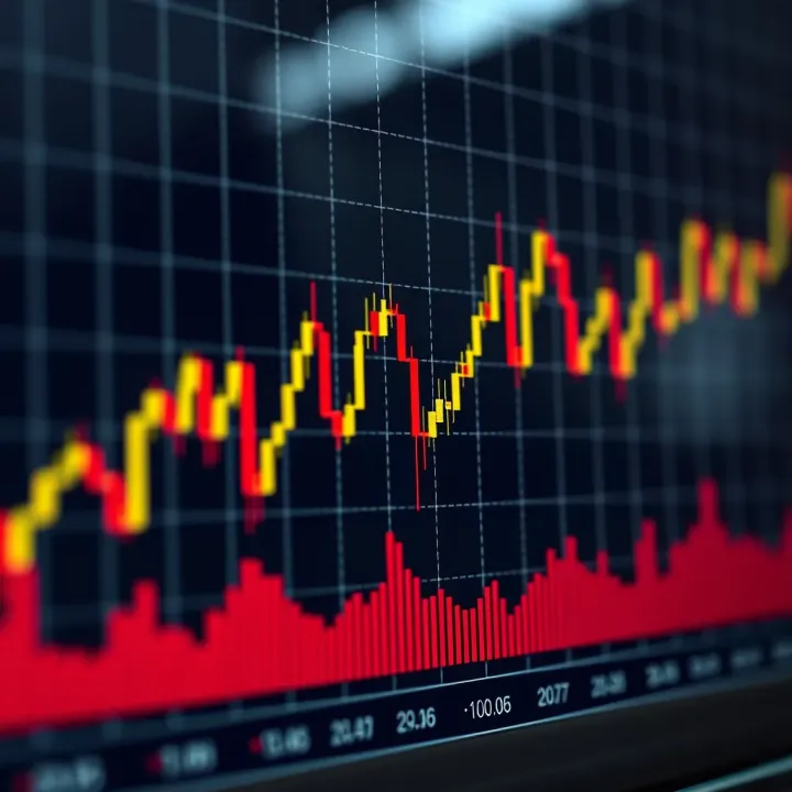
Candlestick charts are arguably the most popular choice among traders, and for good reason. Like bar charts, they provide OHLC data, but in a visually rich format. Each candlestick has a body representing the opening and closing prices, with wicks (or shadows) showing the highs and lows during that period.
A green (or white) candlestick means the closing price was higher than the opening price—a bullish indicator. A red (or black) one means the opposite, signaling bearishness. For stocks like Engro Fertilizers in the PSX, candlestick charts give a colorful and intuitive snapshot of market sentiment.
Certain candlestick patterns can hint at upcoming reversals or trend continuations. For example, a "hammer" candle with a small body and long lower wick might suggest buying pressure after price dips. In contrast, a "shooting star" with a long upper wick and small body could warn of selling pressure.
Other patterns, like "engulfing" candles where a large candle fully covers the previous one, also offer clues. Recognizing these patterns can be a real game-changer for traders trying to spot turning points without relying solely on indicators.
Getting familiar with these chart types and their unique features gives you a solid foundation to read the market’s mood. Whether you favor the simplicity of line charts, the detailed OHLC view of bar charts, or the rich visual cues of candlesticks, knowing when and how to use each can improve your market timing and decision making significantly.
These chart types aren’t mutually exclusive, either. Many traders combine them for a multi-angle view—giving a fuller, more reliable picture before pulling the trigger on a trade.
Using key indicators in trading charts isn’t just a fad; it's a grounded way to boost your understanding of what's going on in the market. Indicators help traders sift through the noise and zoom into signals that highlight possible price moves, momentum, or reversals. For example, a trader spotting a bullish crossover in moving averages can get an early hint that the asset’s price might climb soon.
Putting these indicators on your charts doesn't clutter things up when done right; instead, they can simplify decision-making by providing clearer entry and exit points. But remember, indicators aren't foolproof—combining a few types and looking for agreement among them often sharpens your view.
At their core, both simple moving averages (SMA) and exponential moving averages (EMA) smooth out price data to reveal trends. The SMA calculates the average price over a set number of periods, assigning equal weight to all data points. Think of it as taking a slow but steady glance at the market.
On the flip side, the EMA puts more emphasis on recent prices, making it respond quickly to price changes. This is useful if you’re monitoring fast moves—for instance, a day trader watching a 12-period EMA can spot trend shifts faster than with an SMA.
Choosing between them depends on your trading style. If you prefer conservative signals with less noise, SMA might be your friend. For quicker decision-making in volatile markets, EMAs often offer an edge.
Moving averages act like a compass showing the market’s direction. When prices stay above a moving average, it suggests an uptrend, while prices below indicate a downtrend. Crossovers—where a short-term average crosses a long-term one—are especially useful. For example, if the 50-day SMA crosses above the 200-day SMA, traders call it a "golden cross," often seen as a bullish sign.
These trend signals help traders avoid jumping in with the crowd blindly, offering a disciplined way to ride the waves rather than get caught in them.
The RSI measures the speed and change of price movements to show whether an asset is overbought or oversold. It ranges from 0 to 100, with readings above 70 typically signaling overbought conditions, while below 30 indicates oversold.
Think of RSI like a gas gauge for momentum—it warns when prices might be stretched too far one way. For example, if the RSI shoots above 70 on a stock listed on the Pakistan Stock Exchange, it might be time to consider that a price pullback could be looming.
Traders use RSI to time entries and exits better. Besides spotting overbought and oversold levels, RSI divergence is a powerful tool: if prices make new highs but RSI doesn’t, it often hints at weakening momentum and a potential reversal.
A practical tip is combining RSI with other indicators—say, moving averages—to confirm signals. This mix lowers the chance of false alarms and provides a clearer picture before making a move.
Volume shows the number of shares or contracts traded over a period and is the fuel behind price moves. A price increase with high volume shows strong buying interest, while the same move on low volume might be questionable.
For instance, during an earnings announcement on the Pakistan Stock Exchange, volume often spikes, offering clues about trader confidence in the reported results.
Paying attention to volume trends helps confirm if a price movement is sustainable. Rising prices with increasing volume typically signal a strong uptrend. Conversely, if prices climb but volume declines, the rally might be losing steam.
Volume indicators like On-Balance Volume (OBV) or Volume Moving Average can assist in tracking these shifts. For example, a rising OBV alongside price gains reinforces the bullish scenario.
Pro Tip: Always cross-check volume spikes with news or events; a sudden jump might reflect external factors, not just market sentiment.
Integrating these key indicators into trading chart views arms traders with more than just raw price data. They add depth to analysis, enabling clearer, more confident trading decisions in the vibrant markets of Pakistan and beyond.
Adjusting and customizing trading chart views is essential for traders looking to gain a clearer picture of the market. Rather than sticking to default settings, tweaking these views allows traders to tailor their charts to fit their unique styles and strategies. For instance, a day trader focusing on rapid price swings will need different chart setups compared to a long-term investor watching monthly trends. Customizing charts can reveal hidden details, reduce noise, and help traders make better decisions without getting overwhelmed.
Time frames in trading charts give a different lens on price action. Short-term views, like 5-minute or 15-minute charts, help spot quick moves and are preferred by scalpers and intra-day traders. They show rapid price changes but can be noisy and prone to false signals. On the other hand, long-term views like daily, weekly, or monthly charts smooth out these short fluctuations and reveal broader trends, making them useful for swing traders and investors aiming for bigger picture decisions.
Imagine you’re watching a stock like Pakistan's PSX-listed company Engro Fertilizers. The 15-minute chart might show some sudden spikes due to intraday news, whereas the weekly chart highlights a steady price climb over months. Picking the right time frame depends largely on your trading style and goals.
Selecting the appropriate time frame goes beyond just preference; it aligns with your trading horizon and risk tolerance. For instance, if your focus is to close trades within a day, charts ranging from 1 to 30 minutes suit you best. Conversely, if you hold positions for weeks or months, daily and weekly charts offer the insights you need.
A good tip is to combine multiple time frames. Start with a longer-term chart to identify the prevailing trend, then narrow down to a shorter frame to spot entry and exit points. This approach, known as "top-down analysis," helps spot strong trends while minimizing distractions from short-lived price noise.
Indicators are the trader’s toolbox, but loading every single one can clutter the chart and confuse rather than clarify. It's smart to pick indicators that complement your strategy. For example, a momentum trader might favor the Relative Strength Index (RSI) and Moving Average Convergence Divergence (MACD) for timing entries and exits. Meanwhile, a trend follower might rely more on moving averages and volume indicators.
Let’s say you're trading the KSE 100 index. Adding a simple 50-day moving average alongside volume bars might highlight whether recent price moves are backed by strong market participation. Customizing indicators lets you focus on information that truly matters, avoiding unnecessary distractions.
Too many indicators can make your chart look like a Christmas tree, which makes it hard to discern the bigger picture. The key is balance — use just enough to confirm your decisions without muddling the view. A good practice is to stick with two or three indicators that serve different purposes — such as one for trend, one for momentum, and one for volume.
Uncluttered charts make it easier to spot trends, reversals, and breakout levels. Always ask yourself if an indicator adds real value or just fills space.
Annotations help mark significant market events directly on charts, acting like your personal trading diary. You can note earnings announcements, key support and resistance levels, or even personal trade entry and exit points. This makes it easier to review what influenced your decisions later on.
For example, if you mark the date when the State Bank of Pakistan decided to change policy rates, you can correlate how that affected the broader market or particular stocks. This contextual awareness sharpens your trading edge.
Alerts are practical tools that notify you when price reaches a specific level or when an indicator triggers a signal. For instance, setting an alert to ping when a stock crosses above its 200-day moving average can help you act promptly without constantly staring at charts.
Effective use of alerts means adjusting them to avoid overload — only set notifications for those key price points or indicator signals relevant to your strategy. Too many alerts can be distracting and lead to missed opportunities or rash decisions.
Smart customization of chart views, including time frames, indicators, and alerts, empowers traders to stay focused and act decisively. It’s about making your charts work for you, not the other way around.
Having a good grasp of trading chart views is half the battle. To truly make them work in your favor, following some practical hints can save you from costly blunders. This section digs into hands-on advice designed to help traders avoid common pitfalls, combine charts wisely, and develop habits that improve market reading skills. It’s all about turning theory into practice for smarter trading in Pakistan’s markets.
Charts are a trader’s best friend but also a tricky one. Sometimes, a candlestick pattern or volume spike might look promising but doesn’t pan out as expected. For instance, a “false breakout” where prices briefly pour through support or resistance only to snap back can trick even seasoned traders. Recognizing these misleading signals means being skeptical and looking for confirmation. Avoid jumping into trades just because a certain pattern appears; instead, wait for supporting indicators or additional price action. This approach protects you from chasing phantom moves that burn money.
Never rely on a single chart or indicator. Cross-checking with other data like economic reports, news events, or alternative charts (like moving from a 15-minute to a daily chart) can help validate what you’re seeing. For example, spike in volume supported by a positive earnings release for a company listed on the Pakistan Stock Exchange (PSX) is more trustworthy than just a volume blip without news. By layering information, you reduce the chance of acting on incomplete or distorted pictures, a crucial skill in volatile markets.
Different chart types offer different angles. Combining candlesticks with line charts or volume bars can reveal nuances price alone misses. Say you spot a bullish engulfing pattern on a candlestick chart but the volume doesn't confirm it—that’s a red flag. Using complementary charts means you’re not putting all eggs in one basket but piecing together a fuller story. This blend helps you time entries and exits more precisely and avoid surprises.
Confirming what the charts are telling you is vital. When you think a trend change might be brewing, look for signals across multiple charts and time frames. A trend reversal indicated on a daily chart but ignored on a weekly could be just noise. For example, in forex trading, a downward RSI combined with a Doji star candlestick on the 1-hour chart, supported by a decreasing moving average on the 4-hour chart, sharpens the conviction that a reversal is near. This kind of cross-confirmation boosts confidence in your trading decisions.
Charts become much easier to read the more you engage with them. Make a habit of daily practice, even if it’s just watching a few symbols on the Pakistan Stock Exchange or Karachi Cotton Exchange, to see how chart views shift with market news and volume changes. The goal is to develop an intuitive feel so you can spot opportunities and risks faster. Trading simulators or paper trading can be good playgrounds without risking capital.
It’s tempting to jump from one strategy to the next, but tracking how your chart analysis works in real conditions is the best way to improve. Keep a trading journal noting which chart views you relied on, what you expected, and how it turned out. Over time you’ll see patterns in your own strengths and blind spots. For example, you might find you miss early trend reversals or get shaken out by false volume spikes. Honest review helps refine your methods and makes you a better trader in the long run.
Remember, effective use of chart views isn’t just about having the right tools but about using them wisely, consistently, and with a bit of skepticism to win in the markets.
By following these practical tips, traders in Pakistan and beyond can make better sense of the many signals flashing on their screens and turn that knowledge into smarter moves.
📊 Learn how to spot and use key trading chart patterns effectively. Includes practical tips and PDF guides for better market analysis and smart trades.
📈 Learn to master trading chart patterns with free PDF guides! Ideal for Pakistan traders looking to boost skills and make smarter trading choices. 📊
Explore Quotex trading in Pakistan 🇵🇰 with our detailed guide—learn platform features, setup, strategies, and smart risk management tips for success 📊💡
📊 Master trading charts with our detailed guide for traders in Pakistan. Learn to read charts, use technical indicators, spot patterns, and avoid common pitfalls! 🚀
Based on 13 reviews