

Understanding Trade View: A Complete Guide for Traders
📊 Explore Trade View in detail—from its features and usability to benefits and limitations—tailored for traders in Pakistan seeking practical insights and tips.
Edited By
Isabella Reed
Trade charts are more than just squiggly lines and colorful bars on a screen; they’re the daily bread of traders and investors, especially in markets like Pakistan's where every decision counts. These charts provide a visual story of how a stock or commodity has performed over time, helping you spot trends, forecast possible price movements, and make decisions that can impact your portfolio’s health.
Understanding trade charts is fundamental if you're serious about trading or investing. Without a solid grasp of what these charts reveal, you’re basically flying blind in the market—like trying to navigate a busy street without any traffic signals.
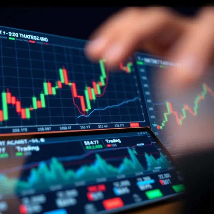
In this guide, we’ll break down the different types of trade charts commonly used, explain what each component means, and walk you through how to analyze them effectively. We’ll toss in examples tailored to the Pakistani market, such as how the Pakistan Stock Exchange charts reflect local trading behaviors, making this a practical tool rather than just theory.
By the end, you'll have a clearer idea of how charts can help you spot buying opportunities or warn you when it's time to step back. We'll also cover chart patterns and tips to avoid common pitfalls, so you’re not just looking at the numbers but truly reading them.
Remember, charts don’t predict the future—they show the past and present trends. Using them wisely can tilt the odds in your favor but never guarantees success.
Ready to get to grips with the heartbeat of trading? Let’s start by understanding what trade charts are and why they matter.
Trade charts are the backbone of informed trading decisions, especially for those active in Pakistan's financial markets. They offer a visual snapshot of market performance over time, allowing traders to spot trends, turn points, and potential opportunities faster than just reading raw data or news headlines.
Using trade charts is fundamental because they transform complex price and volume data into a format that's easier to digest. Think of it this way: you're trying to decide whether to invest in a particular stock listed on the Karachi Stock Exchange (KSE). By looking at the chart, you quickly see if the price is climbing steadily, dipping sharply, or if it's stuck in a range. Without this, you'd be navigating in the dark.
Charts reveal patterns and signals that are practically invisible in raw numbers. For example, if JS Bank’s stock price shows consistent spikes after quarterly earnings announcements on its candlestick chart, a trader might predict similar future behavior and plan entries accordingly. In this sense, charts serve not just as records but as tools to anticipate market moves.
Remember, charts don’t guarantee success but they’re essential for weaving together market psychology, price action, and volume flows into a clearer picture. They help traders avoid emotional, guesswork-based decisions.
In the following sections, we'll break down what exactly trade charts are, the types you’ll typically encounter, and how each plays a distinct role in shaping trading strategies.
Trade charts aren't just squiggly lines and bars on your screen; they're a visual language that shows the history and potential future moves of a market. Understanding the key elements of these charts is essential for traders to make smart, informed decisions—especially in the bustling markets of Pakistan.
Several components form the backbone of every trade chart. These include the price and time axes, volume indicators, and additional features like support and resistance levels, along with trend lines. Knowing these pieces helps traders read charts not just as static images but as dynamic tools that reveal market sentiment and momentum.
The horizontal axis—often called the time axis—runs left to right across the bottom of most trade charts. It represents the passage of time, from past on the left to present on the right, giving traders the ability to follow price movement in chronological order.
This element is important because it allows you to understand when price moves happened. For example, on a daily candlestick chart for PSX (Pakistan Stock Exchange) shares like Habib Bank Limited, each candle shows price action for one day. By looking at this, you can spot recent trends or patterns that emerged after the latest quarterly earnings report. Selecting different time intervals such as 5 minutes, hourly, daily, or weekly charts depending on your trading style can drastically change the view.
Always remember, trading decisions must consider the timeframe. Short-term scalpers might watch 1-minute charts, while long-term investors lean on weekly views. Without properly reading the time axis, you risk misinterpreting signals.
The vertical axis lists the price levels of the traded instrument—showing the scale of movement. It displays how high or low prices have gone over the selected timeframe.
For example, if you’re examining flour mill stocks, the prices on the vertical axis tell you the exact levels where prices peaked or dipped—helpful to identify if a stock price like that of Engro Foods is breaking past its usual range. Price movements captured here help set entry and exit points.
Understanding the price axis allows traders to quickly assess volatility, spot significant price jumps, or watch for breakouts beyond a particular price point. It's crucial not to overlook this aspect, as choosing charts with inappropriate price scales (too zoomed in or out) can misguide your analysis.
Volume shows the number of shares or contracts traded during a given time period and is often displayed as bars below the main price chart. It’s a key indicator of market interest and momentum.
In Pakistan's market context, volume can signal strength or weakness behind price moves. For instance, if a stock like Pakistan Oilfields’ price jumps but volume is low, it's a sign the move might not be reliable. Conversely, a breakout on high volume usually confirms the trend.
Volume acts like the fuel for price trends—without it, moves lack conviction. When volume spikes alongside price increases, it suggests strong buying interest. On the flip side, if prices drop with high volume, many traders might be rushing to sell.
Say you’re following Lucky Cement. If the price approaches a resistance level but volume thins out, it’s a possible sign that the rally is weakening. Traders can use this insight to decide whether to hold or exit positions.
Monitoring volume alongside price action helps avoid false breakouts and improves the odds of successful trades.
Support and resistance are invisible lines drawn on charts where price historically tends to stop and reverse. Support acts like a floor where prices usually find buyers, while resistance is a ceiling where selling pressure often increases.
For example, traders tracking systems like TRG Pakistan might notice that the stock frequently bounces back up when falling near Rs. 35 (support level) or struggles to pass Rs. 42 (resistance level). Knowing these levels helps set realistic targets and stop-losses.
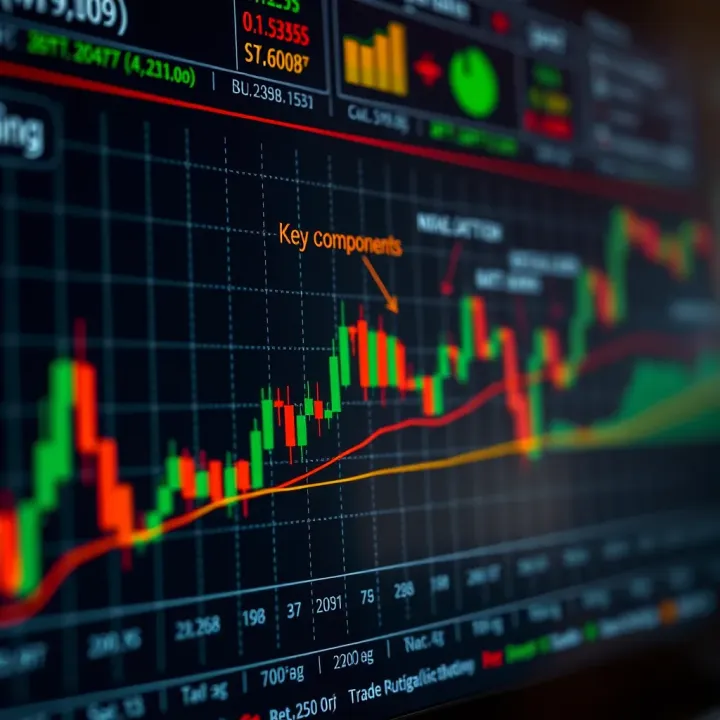
Identifying these zones early lets traders anticipate price behavior instead of reacting blindly.
Trend lines connect either consecutive lows in an uptrend or consecutive highs in a downtrend, helping visualize the direction and speed of price movement. Channels extend this idea by creating parallel lines that contain price fluctuations.
If you imagine the Karachi Stock Exchange index rising steadily, drawing a trend line below the lows can help spot when momentum is fading or strengthening. Channels add an extra layer by showing upper and lower boundaries within which prices oscillate.
These tools enable traders to spot entry points on pullbacks during an uptrend, or signs of reversals if price breaks out of the channel.
Grasping these key elements of trade charts empowers traders to see beyond raw numbers and patterns. They become tools for informed decision-making, aligning perfectly with trading strategies customized to Pakistan’s unique market movements.
Understanding these fundamentals will not only improve how you read trade charts but also significantly enhance your confidence in predicting market moves more accurately.
Understanding how to read trade charts is a game changer for anyone involved in the markets—especially in Pakistan where market dynamics can shift quickly. Reading charts effectively goes beyond just spotting trends; it’s about interpreting those signals in context, making smarter moves, and managing risks with more confidence.
By knowing how to decode what the charts are telling you, you can see the bigger picture, anticipate market turns, and adjust your strategy before things get out of hand. This section breaks down the core skills every trader should master, from spotting basic trend directions to using technical indicators and selecting timeframes that suit your trading style.
At the heart of chart reading is understanding whether the market is bullish or bearish. A bullish trend means prices are generally rising, signaling optimism and potential buying opportunities. This trend can be spotted by a series of higher highs and higher lows on the chart. For example, in Pakistan’s stock market, seeing the KSE-100 index making steady upward moves over days or weeks suggests a bullish sentiment.
On the flip side, a bearish trend shows falling prices, indicating pessimism and potential selling pressure. This is identified by lower highs and lower lows. For instance, if a popular stock like Lucky Cement shows a sustained downward movement, it signals bearish trend.
Recognizing these trends helps traders align their trades with the overall market direction rather than swimming against the current.
Chart patterns are like the market’s secret codes, giving clues about possible future moves. The Head and Shoulders pattern looks like a baseline with three peaks—the middle being the highest (the head). It usually signals a reversal; after a bullish run, this pattern can indicate a coming downtrend.
For example, if Hub Power Company’s price chart shows this pattern, a trader might prepare to exit long positions.
The Double Top and Double Bottom patterns are also common; a double top means the price hits a resistance level twice then drops, suggesting a bearish reversal. The double bottom is the opposite—a support level hit twice signaling a potential bullish reversal.
These patterns aren’t foolproof but give traders a heads-up to watch their positions closely.
Moving averages smooth out price data to identify trends more clearly. The Simple Moving Average (SMA) calculates the average price over a set number of periods. The 50-day and 200-day SMAs are popular among traders. For instance, when the 50-day SMA crosses above the 200-day SMA (a golden cross), it suggests bullish momentum.
In Pakistan’s market, if a bank’s share price holds above its 200-day SMA, it’s often seen as a sign of strength.
The RSI measures momentum on a scale from 0 to 100, helping traders spot overbought or oversold conditions. Typically, an RSI above 70 suggests overbought conditions where prices might drop soon, while below 30 suggests oversold and potential for a bounce back.
Say, a textile company’s stock has an RSI of 75; a cautious trader might delay buying, expecting a pullback.
The Moving Average Convergence Divergence (MACD) tracks momentum by showing the relationship between two moving averages. It’s great for spotting buy or sell signals when the MACD line crosses the signal line.
Other helpful indicators like Bollinger Bands or stochastic oscillators also add layers of info, but it’s wise not to load charts with too many indicators—they can muddy the picture.
The timeframe you choose influences how you read charts. Short-term charts (minutes to days) suit day traders who want quick moves. For instance, traders in Islamabad Bazaar might watch 5-minute charts to catch small swings.
Long-term charts (weeks to months) help investors who want to spot bigger trends and ride them out. A long-term view on Pakistan’s oil sector, for example, helps identify stable growth patterns despite short-term jitters.
Picking a timeframe is about matching your personality and goals. If you like quick trades, the 15-minute or hourly charts might be your friend. If you prefer holding for weeks, daily or weekly charts give clearer signals.
Remember, no single timeframe fits all. Trying to force a short-term strategy on a long-term chart (or vice versa) can lead to confusion and poor decisions.
In Pakistan’s varied market conditions, blending multiple timeframes can provide a more balanced view, like confirming a trend on a daily chart before entering on a 1-hour chart.
Effective chart reading involves combining trend identification, indicators, and timeframe analysis. With these tools, traders can sharpen their insights, avoid false signals, and make smarter plays in Pakistan’s markets.
Practical tips for trading using charts are essential for turning raw data into profitable decisions. While charts give a snapshot of market movements, knowing how to read and apply them effectively separates successful traders from the rest. In Pakistan's markets, where volatility and external factors like political shifts or economic announcements can quickly affect prices, blending chart skills with broader market understanding is key.
Charts show what's happening with price and volume, but they don’t reveal why something is moving. That's where market news steps in. For example, if the State Bank of Pakistan announces a change in interest rates, a chart alone won't help you anticipate the immediate price impact unless you know the news behind it. Relying only on charts often means reacting late.
Charts without context are like a map without landmarks — you can see the roads, but no idea where you're heading.
Charts visualize price action but ignore the reasons for the moves. Important economic data releases, political developments, or company-specific news can cause sharp spikes or drops that charts alone won’t predict. For instance, in Pakistan's oil market, a geopolitical event in the Middle East could upset supply expectations, causing swings that surprise chart-only traders. Combining charts with timely news helps avoid blind spots.
Keep an economic calendar handy and mark key events like inflation reports, trade balance releases, or government policy statements. Before these events, prices might show erratic behavior—higher volatility or uncertainty. For example, around Pakistan’s budget announcements, the stock market can be jittery. Watching charts alongside these events lets traders anticipate breaks or reversals, adjusting their positions accordingly.
No trading method is foolproof, so risk management grounded in chart insights is vital. Charts can guide where to place stop-loss and take-profit points by highlighting support, resistance, and trend changes.
Using recent lows as stop-loss in a bullish trend or highs as stop-loss in a bearish trend helps to limit downside loss if the market reverses. Say you’re trading on the Pakistan Stock Exchange and notice a strong support zone near 45,000 points; setting your stop-loss just below this range can protect you from bigger losses.
Similarly, identifying resistance levels helps set realistic take-profit targets. If a chart shows resistance at 50,000 points where the price struggled before, aiming to exit around this marker locks in profits before the price could pull back.
Charts alert traders to potential reversals or breakouts, so using these clues can improve risk control. For instance, a double top pattern often predicts a drop—traders spotting this can tighten stops or exit early to minimize loss. Using trendlines to confirm the overall market direction helps avoid buying into a false rally.
Every trader’s style is different, so customizing charts helps focus on what matters most and avoid unnecessary clutter.
Platforms like MetaTrader, TradingView, or local brokers' software let you customize charts with tools like Fibonacci retracements, Bollinger Bands, or volume overlays. You can highlight specific timeframes, zoom in on price clusters, and apply indicators that fit your strategy. For example, a day trader might favor 5-minute candlestick charts with RSI, while a swing trader prefers daily charts with moving averages.
Alerts notify you of key price moves without constantly watching screens. Setting price alerts near key support or resistance levels means you catch breakout opportunities early. Indicators like MACD crossings or RSI extremes can generate signals you don’t want to miss. This approach helps especially in Pakistan’s fast-moving markets where price swings can happen overnight.
In short, personalizing your charts and combining them with news and risk controls leads to sharper, more confident trading decisions suited to the Pakistani market’s unique characteristics.
Trade charts are powerful tools, but they can mislead if not used carefully. Many traders, especially those new to markets like Pakistan's, fall into common traps that hinder their success. Recognizing these mistakes early can save you from costly errors and better sharpen your trading strategy. This section highlights two critical pitfalls: relying too heavily on a single indicator and overlooking volume or the broader market context.
One of the biggest blunders you can make is putting all your eggs in one basket by depending on just a single technical indicator. For example, say you use only the Relative Strength Index (RSI) to spot overbought or oversold conditions. While RSI is handy, it doesn’t tell you everything about market trends or potential reversals on its own. If the MACD or moving averages suggest otherwise, ignoring them can lead you to premature or wrong trades.
Diversification in analysis means combining multiple indicators that complement each other. This approach paints a fuller picture of the market’s health. Consider cross-checking momentum indicators with volume trends and price action. By doing this, you reduce blind spots and increase the chances of spotting genuine trading opportunities. Pakistani markets can be volatile and sometimes behave unpredictably; using varied tools helps manage those swings better.
Relying on one indicator is like trying to navigate a city with only a single street sign—you might miss important turns or landmarks.
Volume is often called the "fuel" for price movement, but many traders overlook its significance. Price changes with no volume backing it can be a false signal. For instance, a sudden jump in stock price on the Pakistan Stock Exchange without volume support might just be a one-off event or manipulated move rather than a sustainable trend.
Similarly, ignoring the broader market context—like economic news, political events, or central bank announcements—can skew your chart reading. If traders don’t account for such factors, they might misinterpret price patterns or fail to anticipate sudden volatility. Consider how the State Bank of Pakistan’s policy decisions impact banking stocks or how a trade conflict affects textile exports; these events quickly reflect in charts but only if you look beyond the lines and bars.
To properly interpret charts, always couple volume analysis with an understanding of the market environment. This combination offers clues about the strength or weakness behind a move and helps avoid false signals.
In summary, avoid falling into the trap of single-indicator dependency and neglecting volume or context. Use a blend of chart tools and stay informed about market news to read trade charts reliably and make smarter trading decisions.
📊 Explore Trade View in detail—from its features and usability to benefits and limitations—tailored for traders in Pakistan seeking practical insights and tips.
📊 Master trading charts with our detailed guide for traders in Pakistan. Learn to read charts, use technical indicators, spot patterns, and avoid common pitfalls! 🚀
Explore TradingView’s smart charting tools📊, vibrant community🤝, and strategies tailored for traders in Pakistan🇵🇰 to boost market analysis and decisions.
Explore top trade apps in Pakistan 📱, their features, security tips 🔒, and how to pick the right one for smarter trading decisions. 🚀
Based on 12 reviews